Black Kat Ceramics
2024
Adobe Photoshop
Adobe IllustratorBranding project for a ceramics company. The owner’s name is Kathleen Blackmon, and I suggested playing off of her name for her business’s name.
Kat wanted her branding to have a witchy, cottagecore-type of vibe and reflect her mission of “creating unique, high-quality, handcrafted pieces to fill homes with love, passion, and good vibes.”
Illustration
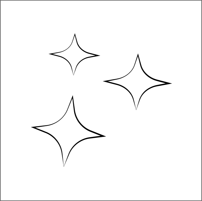
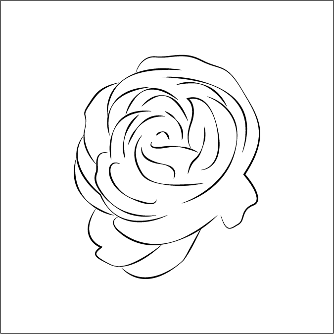
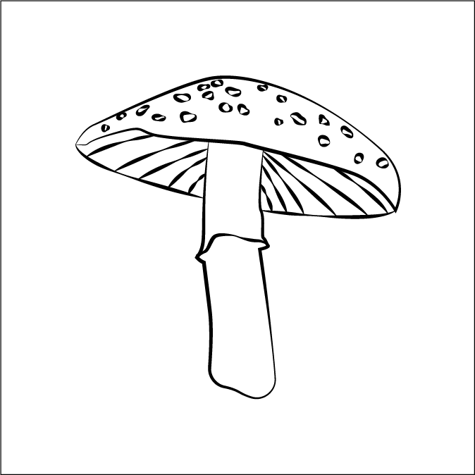
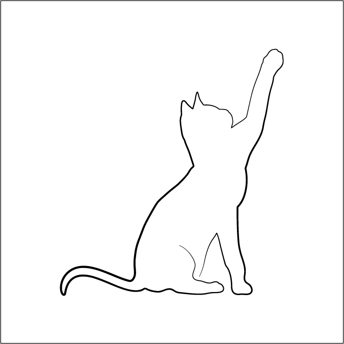
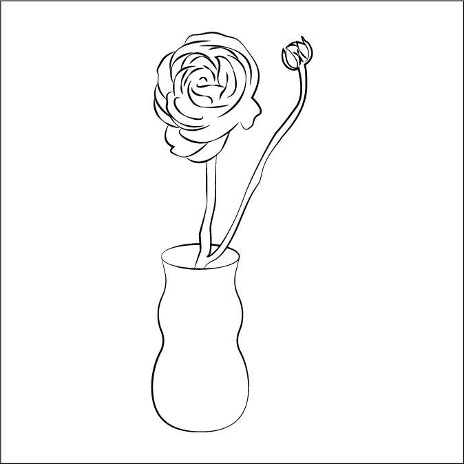
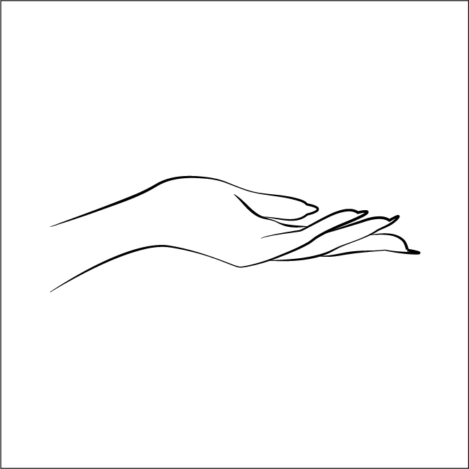
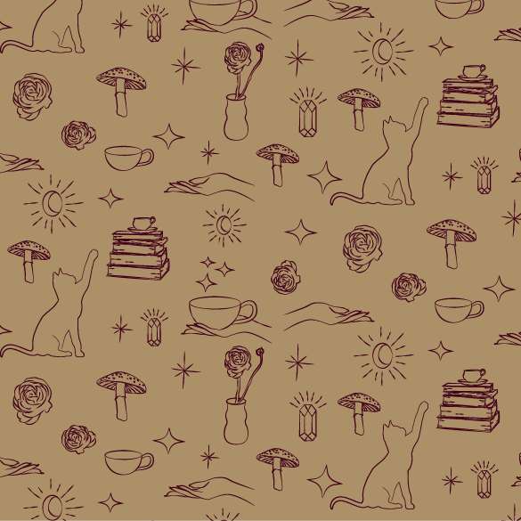
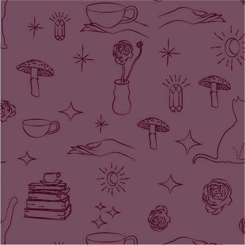
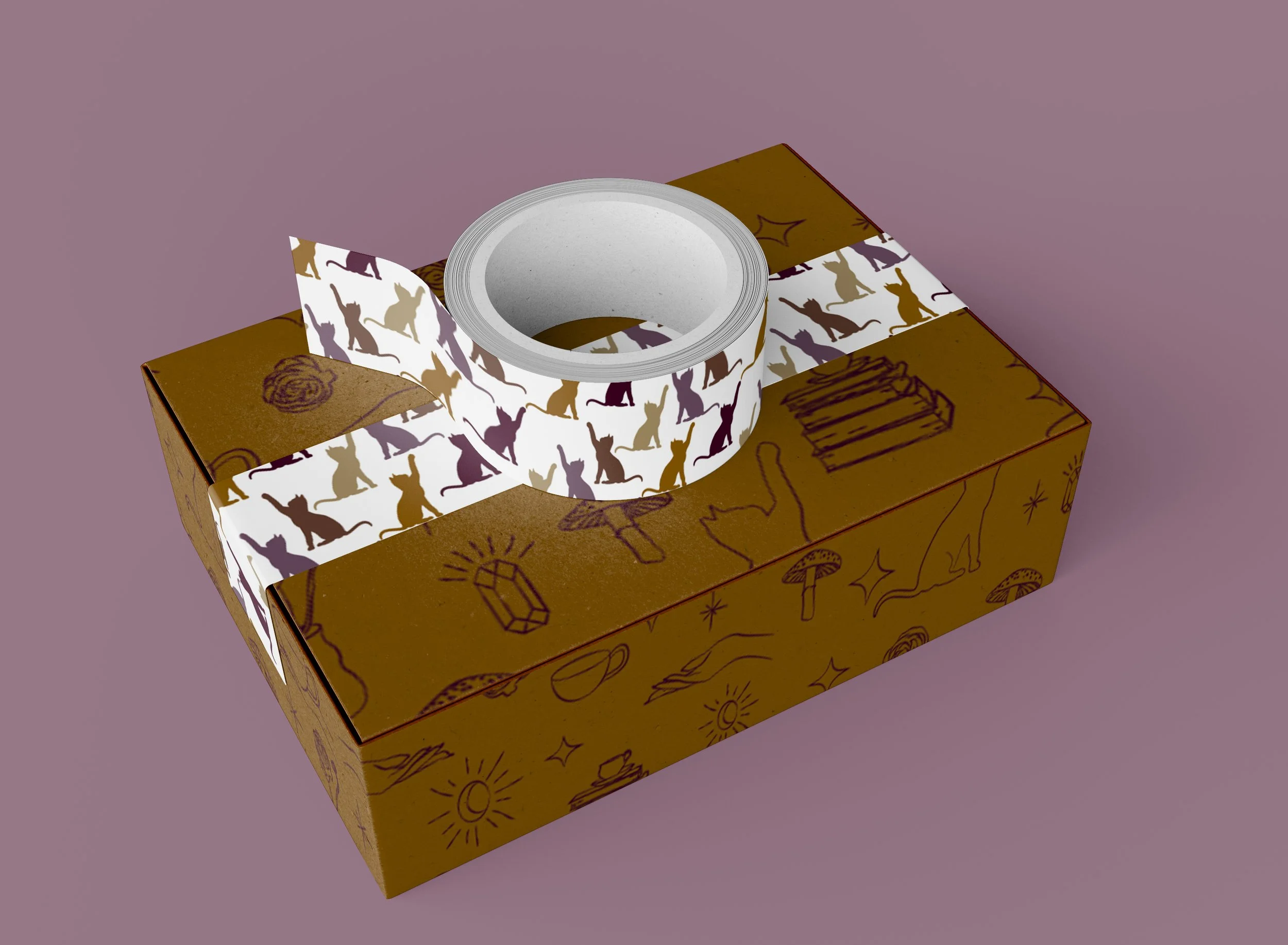
These illustrations evoke a warm, cozy and magical feeling with gems, mushrooms, and stars. Hands bring in a human element, and the cat ties into the brand name. Together, along with ceramic elements in the mugs and vase, they support the personality Kat was looking to achieve for her brand.
Typography
Montecatini Pro was the perfect choice for Black Kat Ceramics because of the ornate details, flourishes, and interlocking letterforms. Those elements enhance the mysterious and witchy type of feeling I was creating.
Monsterrat is a great pairing for Montecatini as a modern sans-serif with similar angles and rounded bowls.
Color
Warm, muted red-violets and earthy orange tones in an analogous color scheme offer a sense of wholesome coziness that support a witchy cottagecore aesthetic that Kat Blackmon was looking for and represent the natural materials of the ceramic clay products.
Hex: #734C61
RGB: 115, 76, 97
CMYK: 0.00, 0.34, 0.16, 0.55
Hex: #6A3C2D
RGB: 106, 60, 45
CMYK: 0.00, 0.43, 0.58, 0.58
Hex: #975B15
RGB: 151, 90, 21
CMYK: 0.00, 0.40, 0.86, 0.41
Hex: #AC9068
RGB: 172, 144, 104
CMYK: 0.00, 0.16, 0.40, 0.33
Hex: #400118
RGB: 64, 1, 24
CMYK: 0.00, 0.98, 0.63, 0.75
Logo in Color
Logo
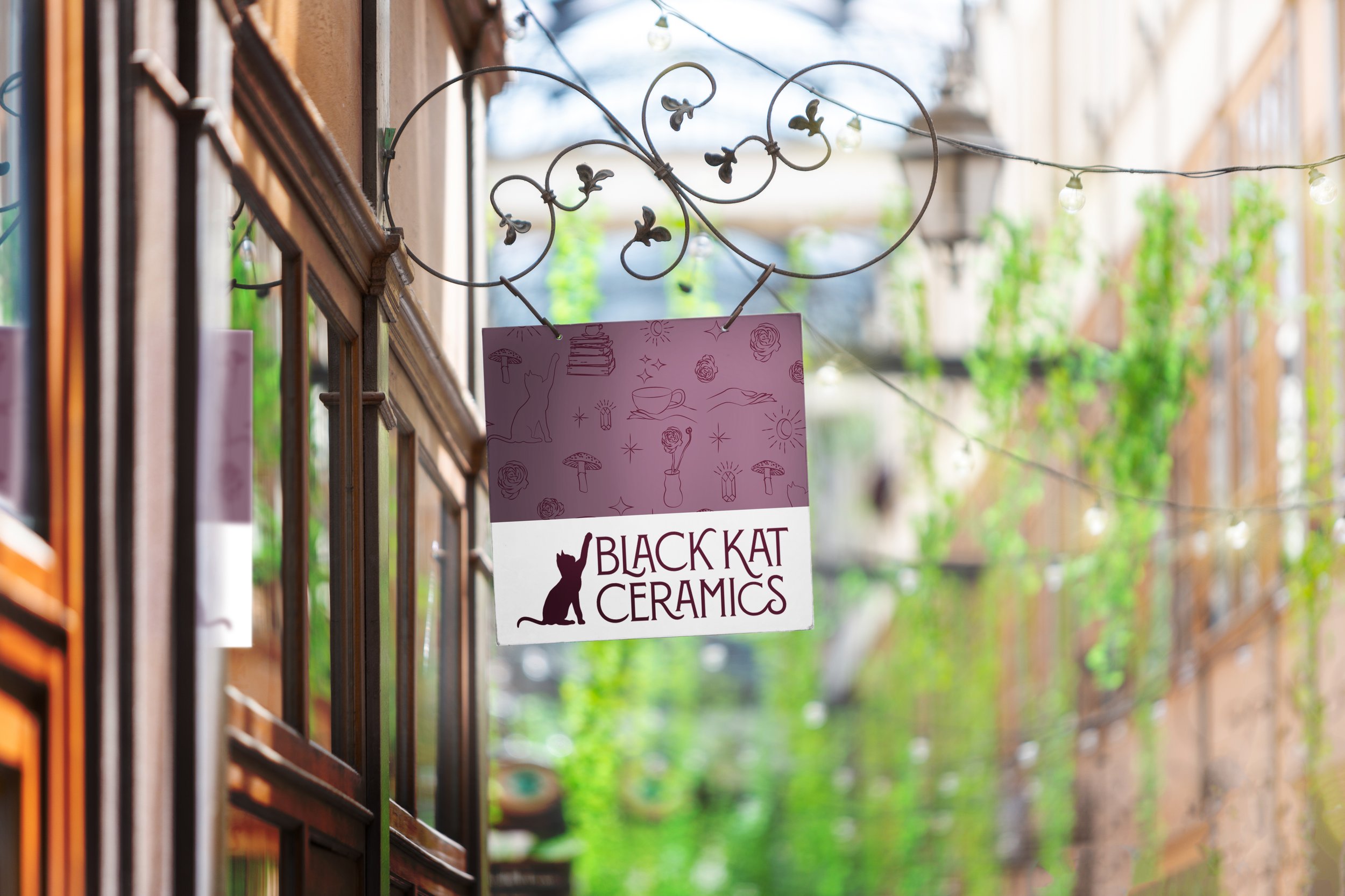
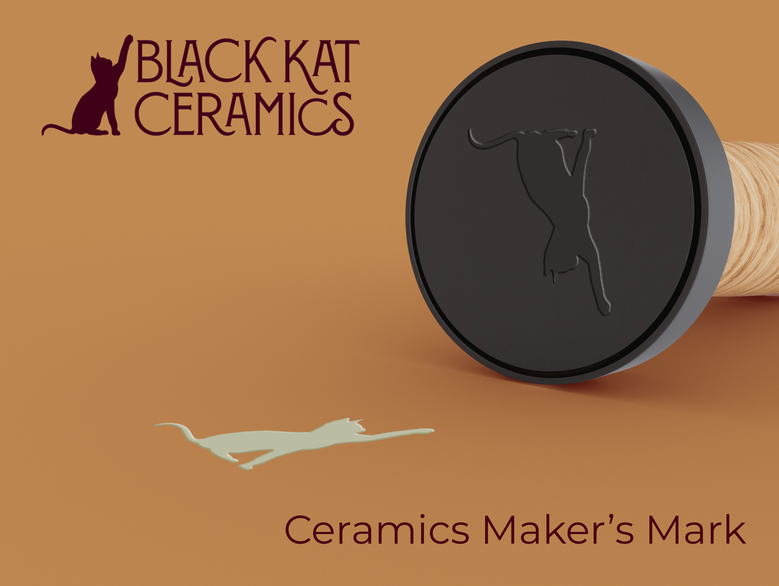
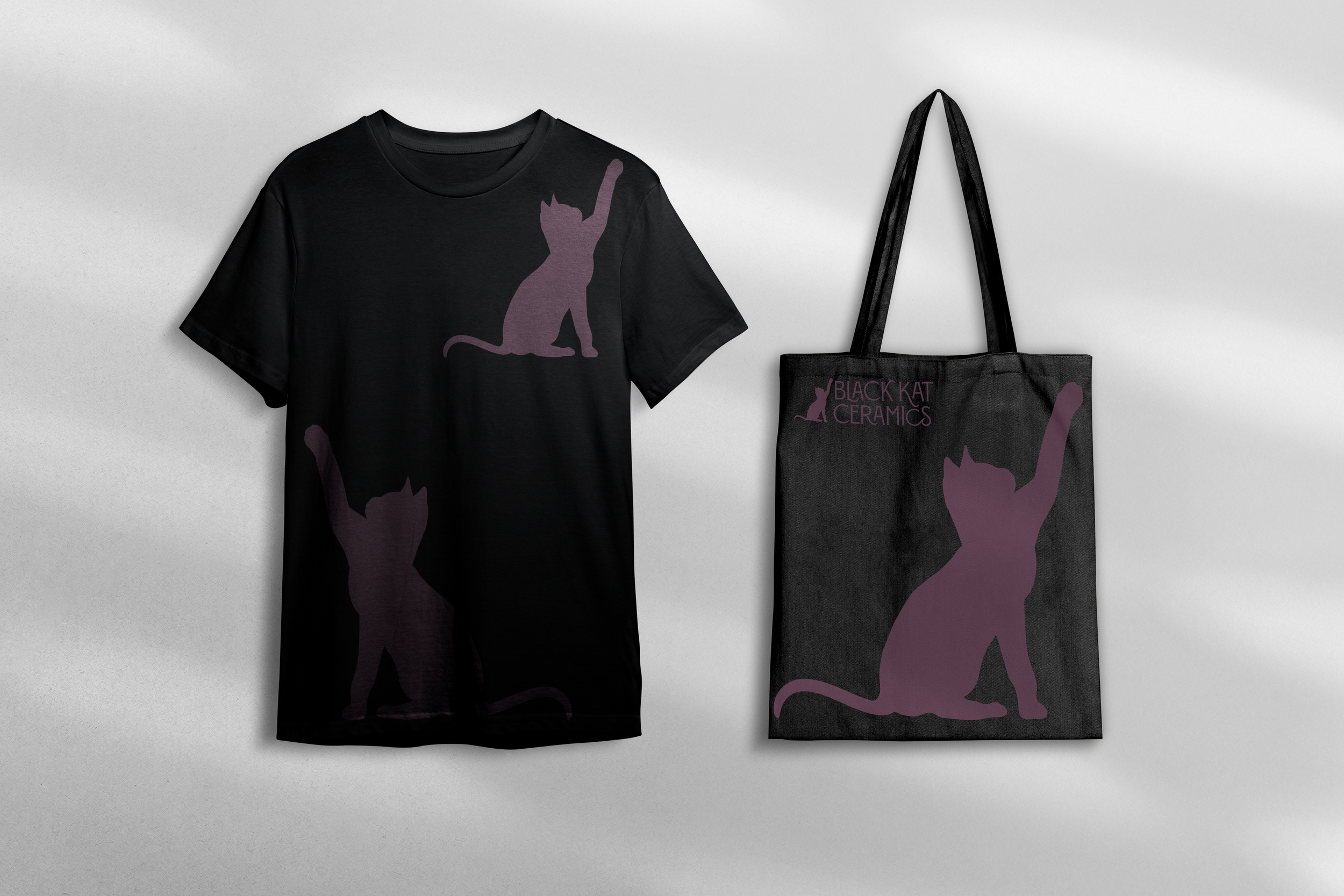
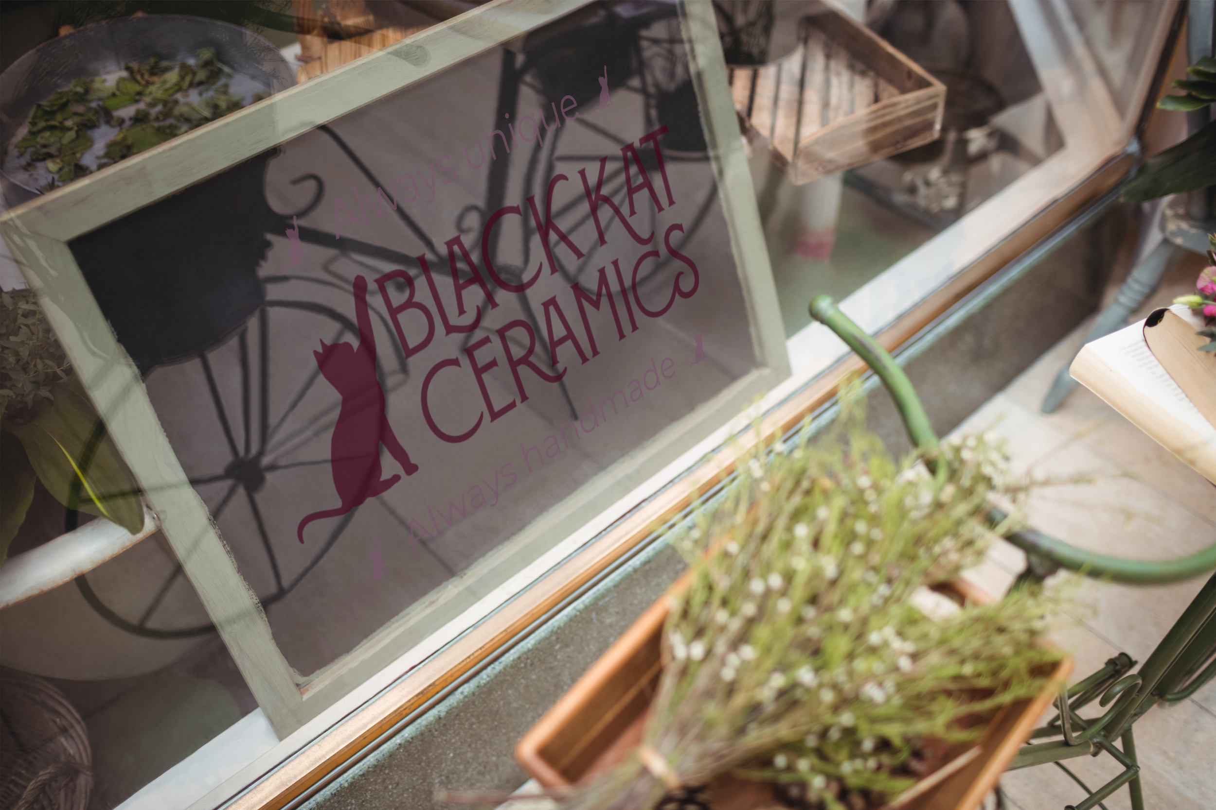
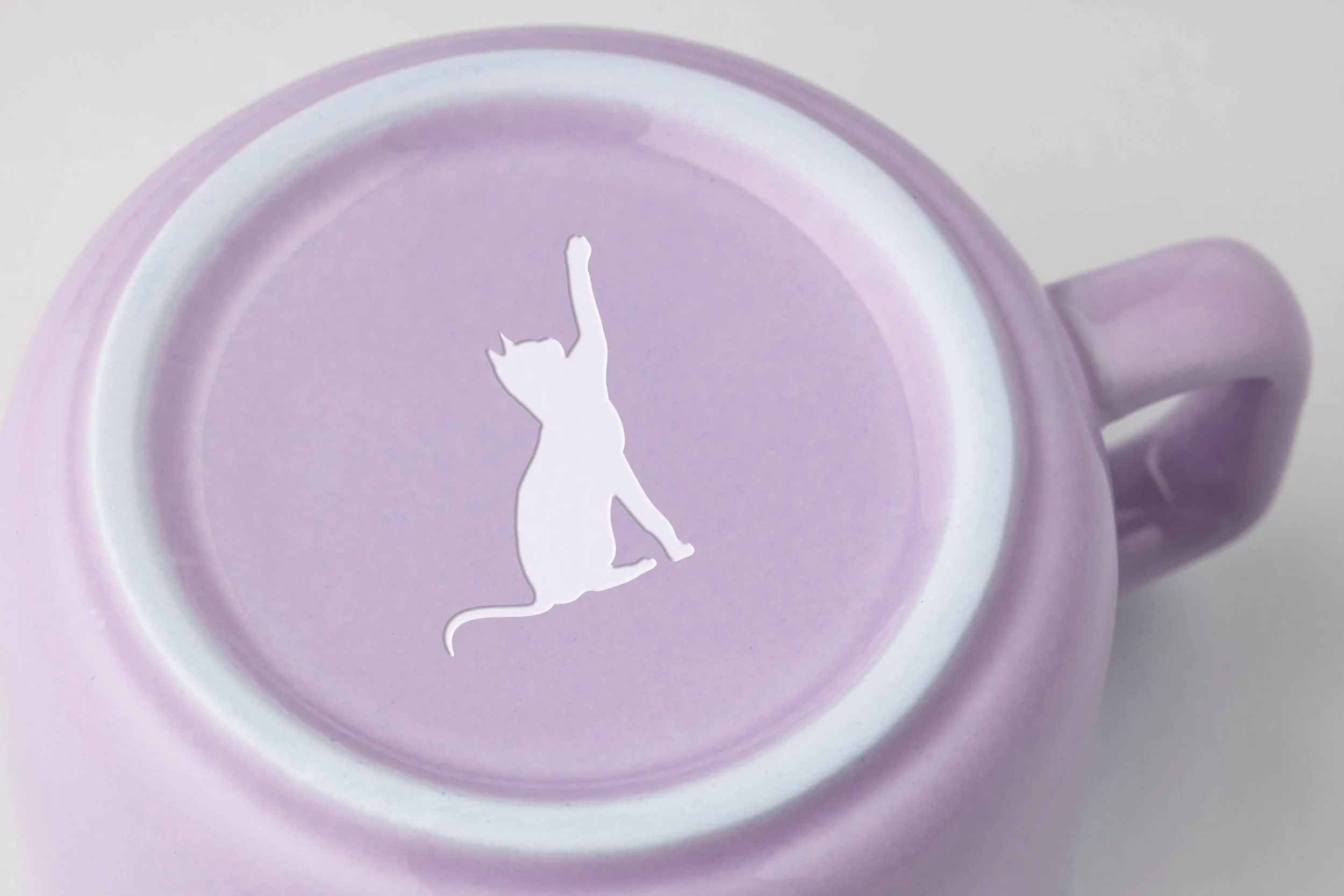
The cat silhouette plays into brand name and can function as a logomark. The cat’s tail shape derives from flourishes in logotype, and the type has been customized to enhance flourishes and add more flow through the letterforms as clay flows through a ceramicist’s hands.
Primary logo
Lockups
Graphic Elements
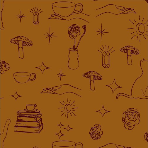
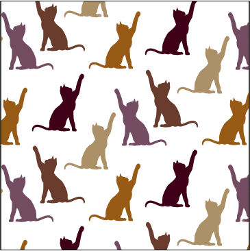
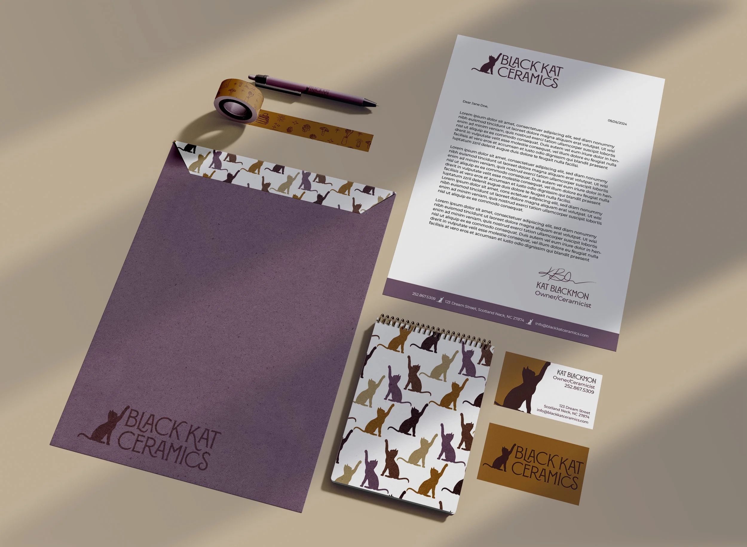
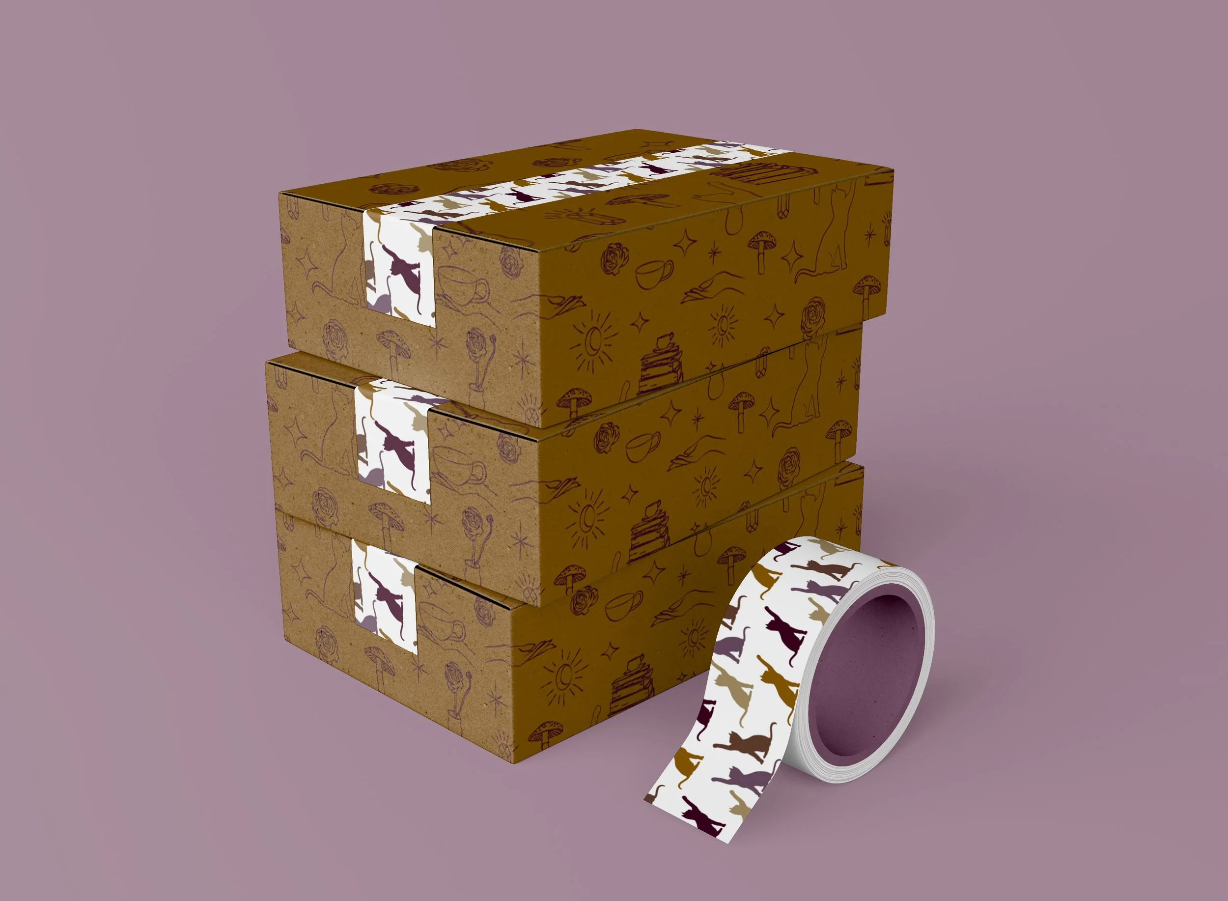
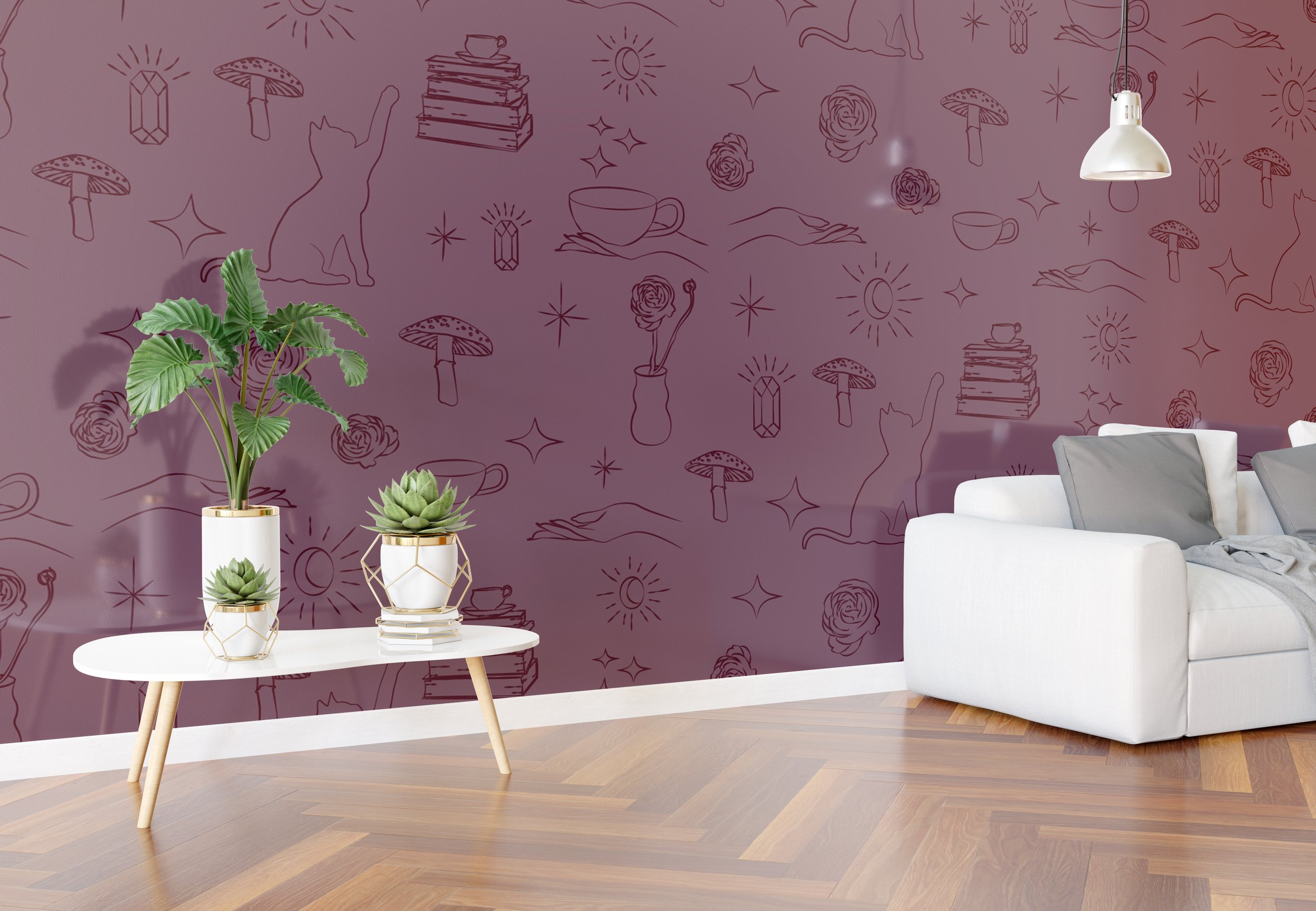
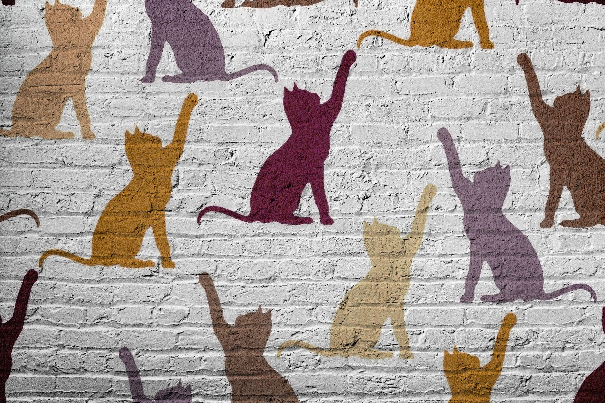
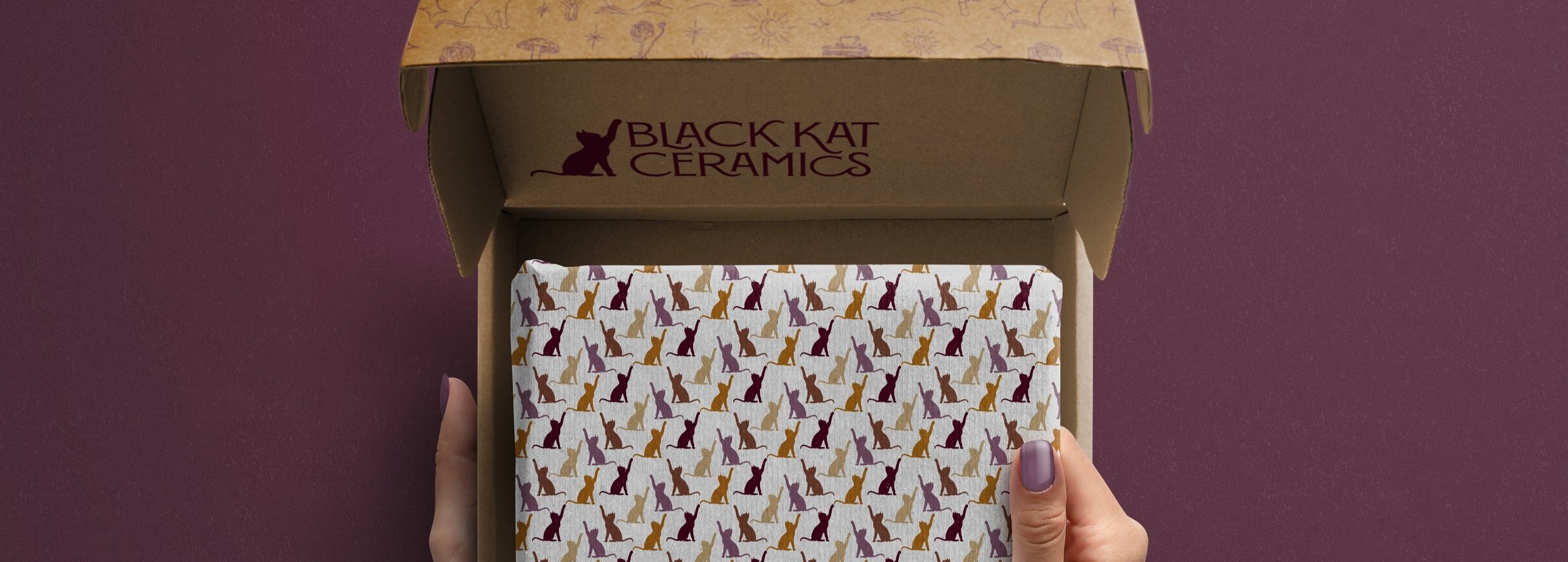
Utilizing the illustrations I drew, I created a brand pattern that exudes the witchy vibe the client and I were going for. This pattern can be used with multiple brand colors. I created and additional pattern featuring the cat silhouette in brand colors for a wider variety of uses.Brand patterns can be used with multiple brand colors and utilized in webpages, packaging, social media posts, and underglaze transfers to place images on ceramic products.
Environmental Contact
Client Response
A snippet of Kat Blackmon’s response to her completed branding taken from the recorded video meeting I had with her to present Black Kat Ceramics, uploaded with her permission.

